Thanks so much and honored to contribute and be published! <3
Would love to submit more content, perhaps some general guide-lines would be useful (EG: ideal scales?)
I for one am still quite new to graphics work.
Will keep practicing! 😀
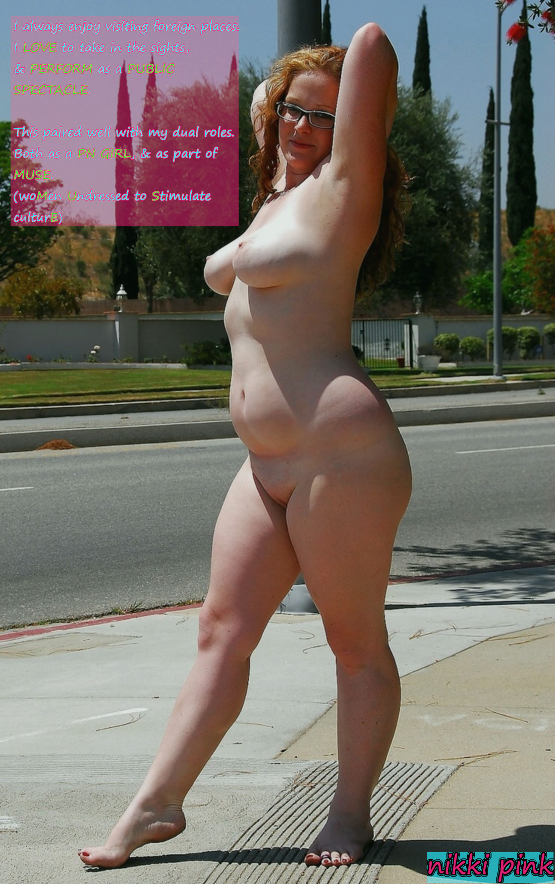
Always nice to see another person contributing! If by scales you mean image size, this one is just about perfect. Wouldn’t want to go much larger than that, but smaller images (within reason) are fine if that’s what you have.
The text should be a bit larger though (proportional to the image, so it’s readable when scaled down if possible). In general I find light text with a black outline is the easiest to read. And for the most part I would prefer text not be in a box like this unless there’s a special reason for it. My personal convention is to use a dark shaded box to set off text as “narration”, as opposed to “dialogue” (especially when it has both, like this one).
That’s just me though, I’m not demanding strict uniformity. As long as the text is fairly readable, the only two things I really ask people to avoid are putting text on a separate block of color next to the picture (just too big a style difference IMO) and covering the model too much, especially the face (and let’s be honest, the “fun parts”). If you have to write on her legs or whatever, it’s not the best but, acceptable if it can’t be avoided.
Love the content but oh my goodness the font color
Some like them chunky
Thanks so much and honored to contribute and be published! <3
Would love to submit more content, perhaps some general guide-lines would be useful (EG: ideal scales?)
I for one am still quite new to graphics work.
Will keep practicing! 😀
Always nice to see another person contributing! If by scales you mean image size, this one is just about perfect. Wouldn’t want to go much larger than that, but smaller images (within reason) are fine if that’s what you have.
The text should be a bit larger though (proportional to the image, so it’s readable when scaled down if possible). In general I find light text with a black outline is the easiest to read. And for the most part I would prefer text not be in a box like this unless there’s a special reason for it. My personal convention is to use a dark shaded box to set off text as “narration”, as opposed to “dialogue” (especially when it has both, like this one).
That’s just me though, I’m not demanding strict uniformity. As long as the text is fairly readable, the only two things I really ask people to avoid are putting text on a separate block of color next to the picture (just too big a style difference IMO) and covering the model too much, especially the face (and let’s be honest, the “fun parts”). If you have to write on her legs or whatever, it’s not the best but, acceptable if it can’t be avoided.
The text looked very stylish originally, but resizing for the blog page hit it pretty hard. You might need to click for full-size.