Interesting Situation

This submission is kind of neat to think about.

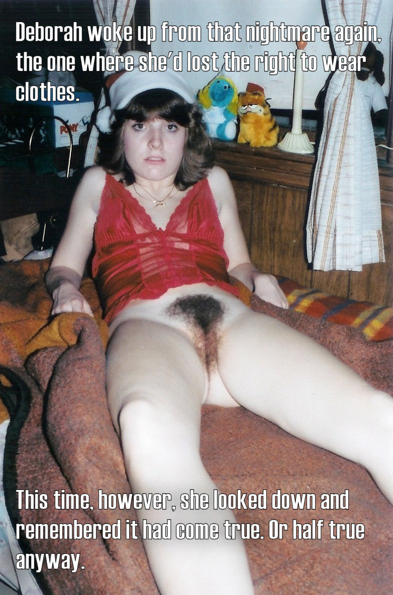
At first I was gonna say, it looks more like she just got out of the shower. But maybe that’s the point. What if she’s permanently naked and just got out of the shower? Yeah that could definitely be pretty awkward. All kinds of misunderstands in the cards there.

She’s probably a little self conscious meeting her roommates wet with a towel on her head, and they’d pick up on that but not know there reason. So they’re thinking “geez lady you’ve been out here for 10 minutes, put you’re clothes on already”. But of course they’re not gonna actually say that to their new roommate. And she in turn would notice they’re uncomfortable, but probably assumes they realize she’s permanude and just aren’t used to it…

I can easily imaging that going on for an hour or two before anyone’s brave enough to directly say what they see as obvious and clear it up.

Caption Tutorial

This is a recreation of a little tutorial I posted back on tumblr. The purpose is to give people a way to do nice looking captions without using tools that cost money. The problem in particular is that none of free tools seem able easily make text with outlined letters, which greatly improves the look and readability. I’ll be using Paint.NET in this tutorial, but any image editor with layers could do the same.

Step 1. Open your image and select a light color or white as the foreground color. In the layers window, click the Add New Layer button so the text you’re about to add will be separate from the background.

Step 2. Select the Text tool, click where you want the text and type your message. You can still move the text around, or change the color or font at this point, so do that now until it looks how you want it. (I recommend a simple sans serif font.) Then click Finish. Repeat this step now for any additional text blocks.

Step 3. In the Layers window, click the Duplicate Layer button. You now have three layers. Select the middle one and choose Adjustments->Brightness / Contrast from the top menu. Set it for minimum brightness and maximum contrast. (Note: For pure white text, you need set both to minimum instead, this may be a quirk of Paint.NET specifically.) You may not see anything yet because it’s still covered by the top layer, but the text on the middle layer should now be black. Now choose Effects->Blurs->Gaussian Blur. A radius 2 or 3 is usually good, but it depends on the size of your text. This smears the black text into a “shadow” behind the light text on the top layer.

Step 4. The shadow is still kind of faint, so just click the Duplicate Layer button again to double it up and make it more visible. And then do it again if it’s still too faint. And there we go! It’s not exactly an outline, but it’s significantly more readable and looks a bit nicer too.

Step 5. Save your image as jpeg. Since the text will become a permanent part of the picture, you might want to save it with a new name and keep the original.

Lastly I want to be clear that I’m not insisting captions be done this way. As long as they’re readable and don’t look horrific, it’s fine. And of course you are still welcome to send me pictures and separate text and let me do it. I use Paint Shop Pro 9 (an old but good commercial program) in case anyone is interested.

Here’s another way you can do it in GIMP, this is probably better because it makes true outlines instead of a shadow. Thanks to Megamegatron99 for finding it.

DMCA / Report Abuse